Podrover Diaries: Building Login and Signup views
Podrover Diaries is about my adventures in building Podrover, a service to track, collect and share your podcast reviews. Subscribe to the RSS feed or join my newsletter to stay up to date with upcoming adventures.
I took me five days to build v1 of Podrover for iPhone. I spent two full days just for login and signup. Weird uh?
My goal was to build something easy to use but also easy to build, without going crazy about different layouts for different devices.
To be fair, part of those two days was also spent building the architecture of the networking and JSON parsing code.
It took me so long because I struggled to come up with a layout that made sense on small and big screens. And I am still not happy with it.
There are very few elements on the login screen:
- Two fields, email and password
- Log in button
- Forgot password button
Version 1 didn’t even include the forgot password button.
What was (and still is) my concern? Creating a layout that didn’t look “empty” on big screens. Not an easy task apparently.
Along the way I made a few mistakes.
Assuming iPhone 5 as minimum size
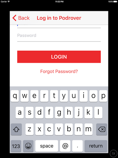
The app is compatible with iOS 10+. That means it doesn’t run on iPhone 4S and below. This means I can design assuming at least a height of 568 points. Wrong. The app can run on iPads, which still have a 3:4 aspect ratio, behaving essentially like an iPhone 4S when it comes to layout.
Using a custom view to display errors
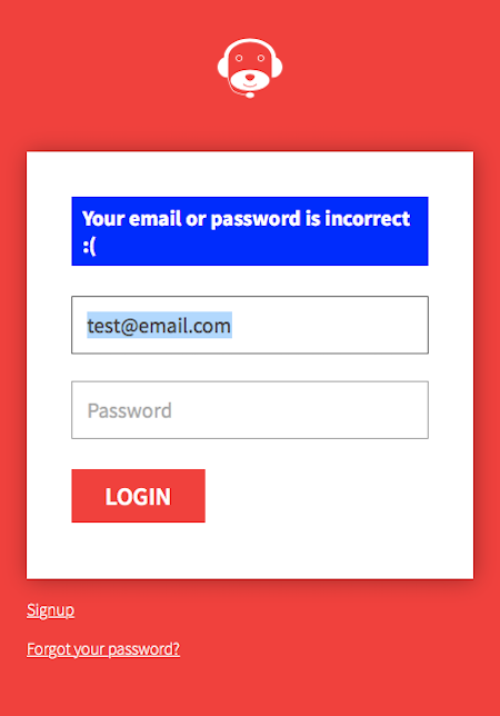
I already built the login screen for the web app like this.

It felt pretty natural to replicate the same on iOS. I shipped version 1 of the app adopting the same layout. Only after approval I realized that on the iPad the error (and part of the email field) was displayed below the navigation bar.

Fixing this looks easy, right? Just move everything down. And if you need more space you can even place login and forgot side by side. But this accentuates the “screen looks empty on big devices” problem.
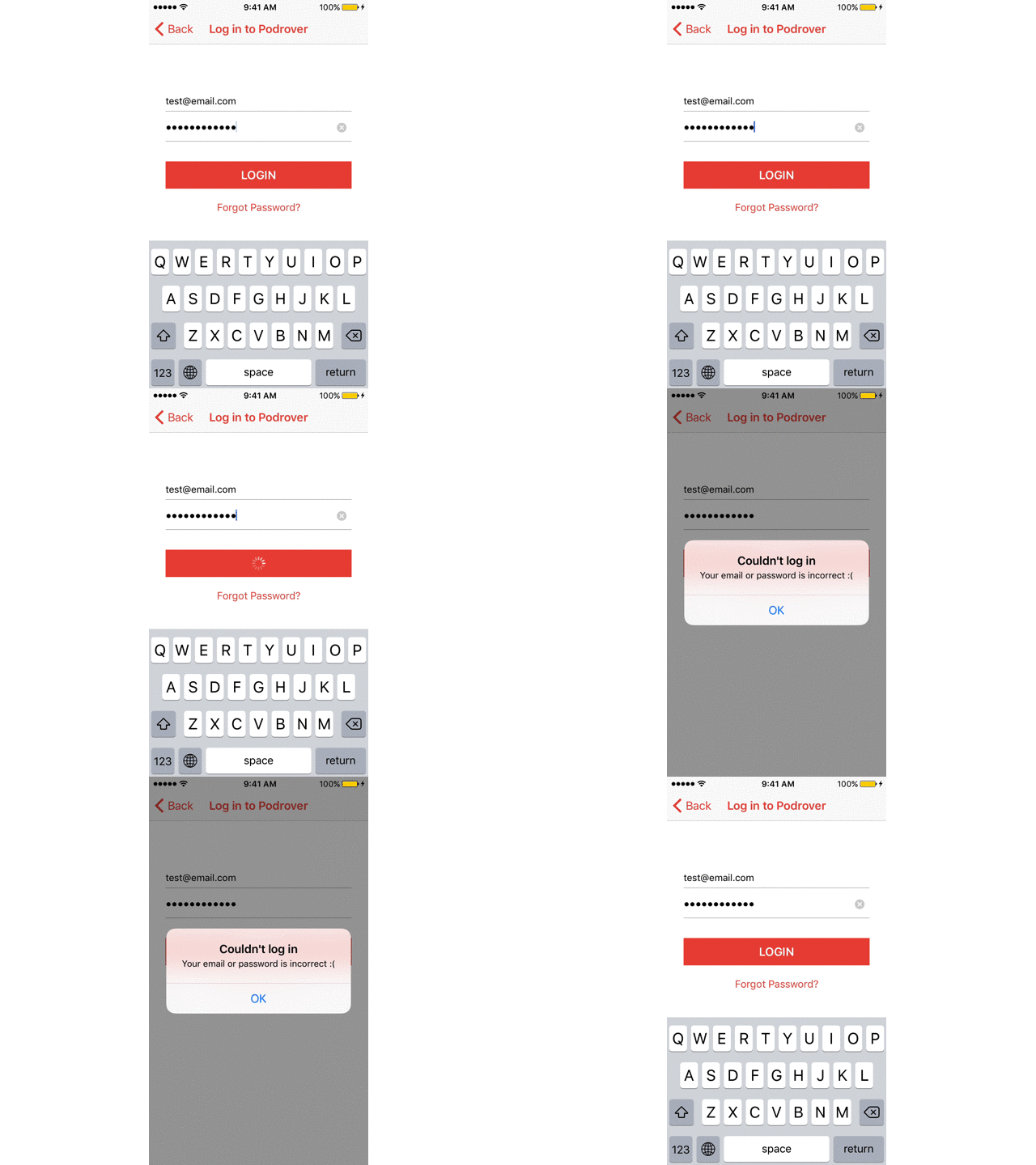
The custom error view was also less accessible than a UIAlertController, so in the subsequent version I switched to that.

While I am not a fan of this “hide and show” dance, it’s pretty nice that the alert hides the keyboard and shows it again after tapping ok (and setting the focus back on the previously selected field). In the past we had to manually hide the keyboard before showing the alert and remember to show the keyboard again after the alert was dismissed.
The custom view error didn’t require the user to tap. This does. It’s a fair compromise though.
Besides mistakes I also made some wise choices.
Turning off autocorrection
Autocorrection shouldn’t be on when you type login credentials like email or password. That little bar with suggestions can be a distraction for the user. Plus you save 44 points of UI. Good for small screens, accentuates the emptiness perception of big screens. Noticing a recurring theme? :)
Login button close to the keyboard
The login button is positioned close to the keyboard, to shorten the trip from the keys to the button itself.
For a bit I wished there was a UIReturnKeyLogin type, so that the login button is part of the keyboard itself. You already can achieve this result but you can’t put a custom label on the “return” button of the iOS keyboard. And you’d need to hide the keyboard while the HTTP call is in progress.
I didn’t like this solution. I prefer the keyboard to always be visible during this kind of focused tasks.
Ready to type UI
As the login view appears so does the keyboard, with the email field already selected. The user has just to type in the credentials.
No scrolling
The keyboard doesn’t cover anything so there’s no need for the user to scroll up to reveal hidden buttons. My layout might suffer the “empty screen on big devices” problem but this is a pretty nice usability improvement. The fewer the taps, the better.
Conclusion
Placing many elements on a screen with limited estate is a challenge but so is placing a few elements in a way that feels balanced on an iPhone 5 and a 7 Plus.
A few ideas I am pondering:
including the logo of the app only on big devices, to fill the empty space. But it doesn’t feel like the “right” solution.
spacing elements out according to the height of the device. Ideally this could be a stack view, where the vertical margins between the elements grow as the device height grows. I didn’t want to venture into this at the time.
splitting the login form in two steps, email first and then password, like Slack does. It introduces an extra API call, to check the email before showing the password view. It’s not a big deal technically.
I am leaning towards the third option, which essentially makes every view of the login phase to look empty. It sounds like a workaround, but also the best compromise at the moment.
Designing is becoming more and more a craft that requires compromise.
If you have other ideas or suggestions, get in touch. I love this kind of conversations.
