Ambiguous Design
Besides hostile design, there’s also another form of toxic design. I call it ambiguous design.
I never met a designer that said “this remote control is perfect”. Even the latest Apple TV remote has some design flaws, mostly due to its shape.
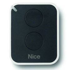
But this is a post about something simpler, the remote control of a gate. I recently installed an automatic gate at my house. The remote control is this.

It looks like they took inspiration from the shape of iOS app icons, using nice rounded corners. There’s two buttons, the one at the bottom opens just one half of the gate (which is not enough room for a car to get in) and the other button opens the whole gate. So it’s simple right? Well, picture this.
It’s nighttime, the remote is in the usual spot, in between the two front seats. You are about to get to your place and you’d like to open the whole gate without looking at the remote. It’s very hard. Either you carefully touch and look for the little light at the top left, which helps you figuring out the orientation of the remote, or you pick up the thing, look at it and push the desired button. It’s a very nice design (no pun intended) but ambiguous.
A very similar story was shared by Marc Edwards during the last Cocoaconf podcast. His garage control has four buttons and only one performed the desired action, opening the door. Marc googled the instructions to re-program the remote. So now all the four buttons perform the very same action. I’ll do the same when I get the chance. It’s very rare that we need to open just one half of the gate.
Now, how many times have you designed some ambiguous UI like my remote control? I did, many times. One of the rules I am following now to prevent ambiguous UIs is to have a clear visual difference to represent the importance of a bunch of buttons.
For example the login page of Podrover has the main action clearly represented as a button and minor actions (signup and forgot password) shown as simple links. There’s no need to A/B test it. It’s evident that most of the times the customer is looking for the login button after entering the credentials. Along the same lines, one way to fix my remote control would be to use buttons of different sizes, or even shapes, so that I can easily discern between the two, in the dark, with some easy tactile feedback.
Bottom line, a cool design doesn’t prevent ambiguities. Usability should come first.